The Spectator podcast suite redesign
The redesign was an ambitious, and extensive set of projects, each with their own branding requirements, design needs, audiences, and objectives. How they visually played into the bigger picture of The Spectator's presence across video, live events and online touch-points needed carefully considered design. Each visual system was comprehensively developed with bespoke illustration, typography, animation and photography.
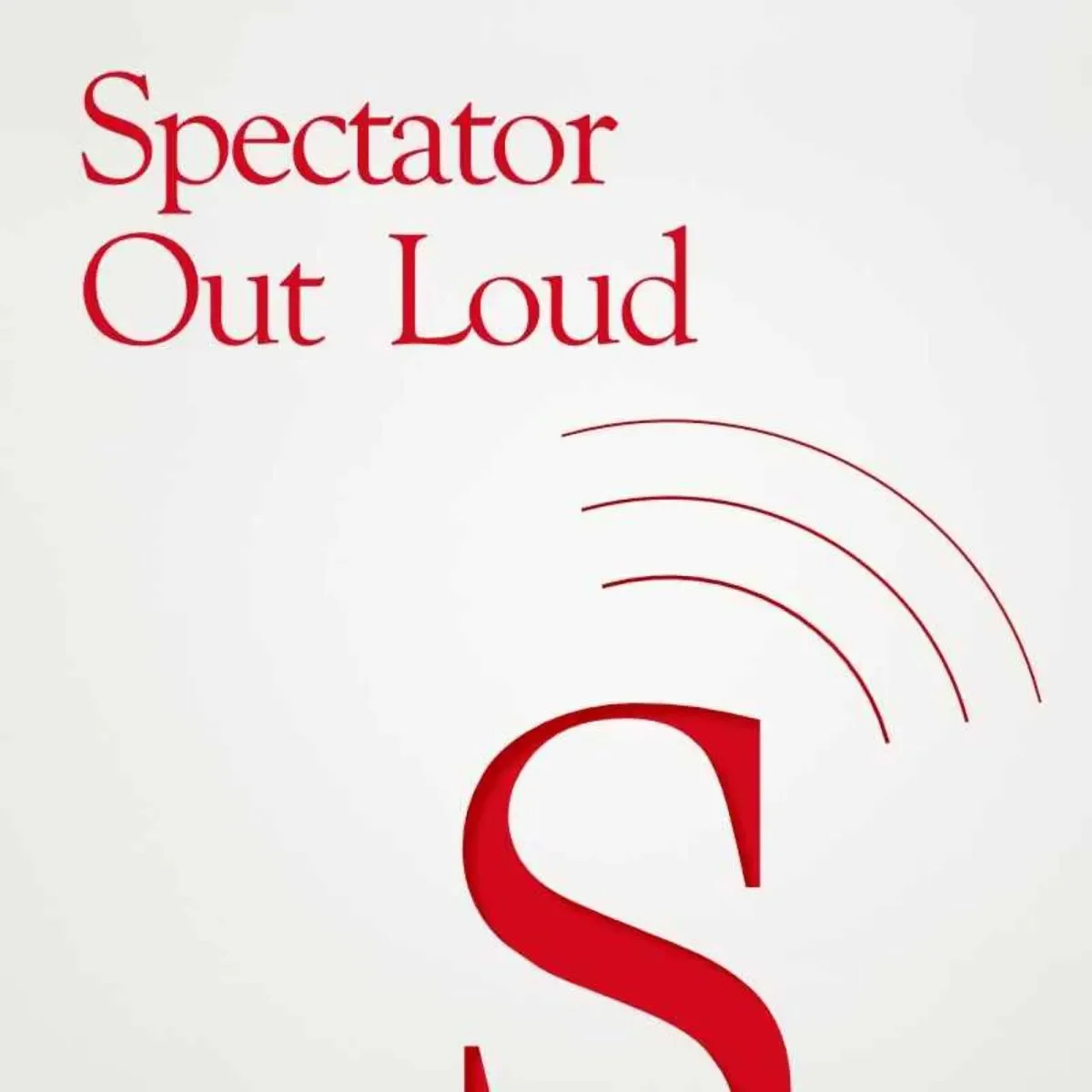
Why a redesign was needed
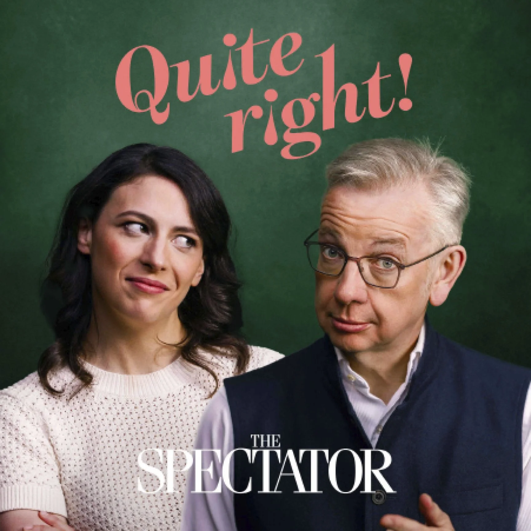
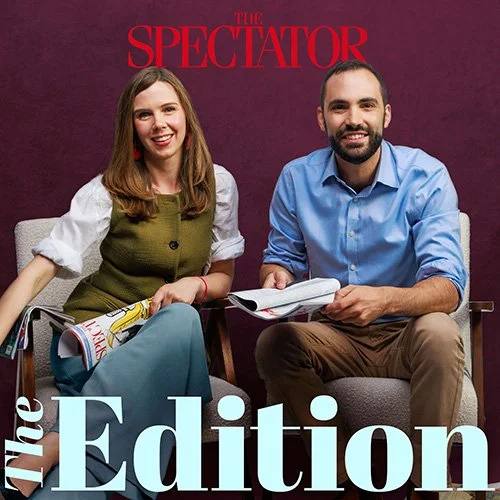
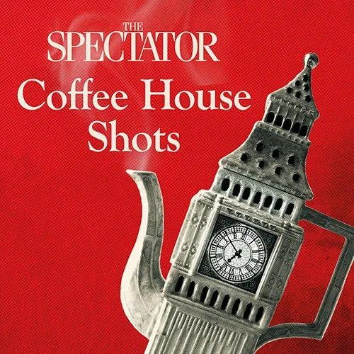
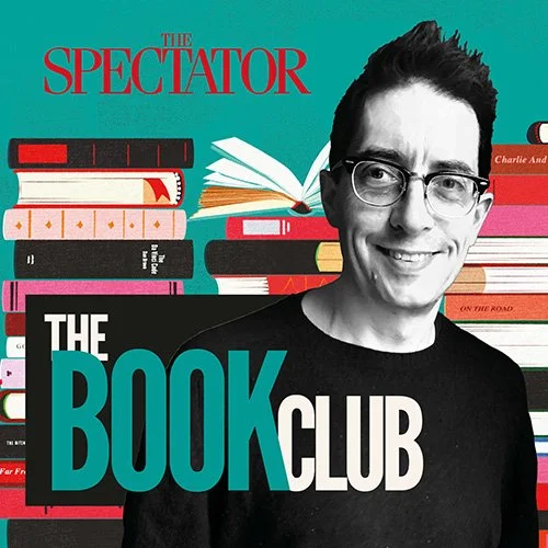
The original designs had become dated and nondescript compared to other trending podcasts. The ‘S’ branding was too anonymous and redundant. The brand recognition of the ‘Spectator’ logo was just not being harnessed. So when the podcast suite was due for a restructure, redesigning them also was an opportunity to move beyond a muted, uniform look, incorporate the ‘Spectator’ logo, introduce human faces, high-impact colour palettes and distinctive title treatments — giving each show a much stronger personality.
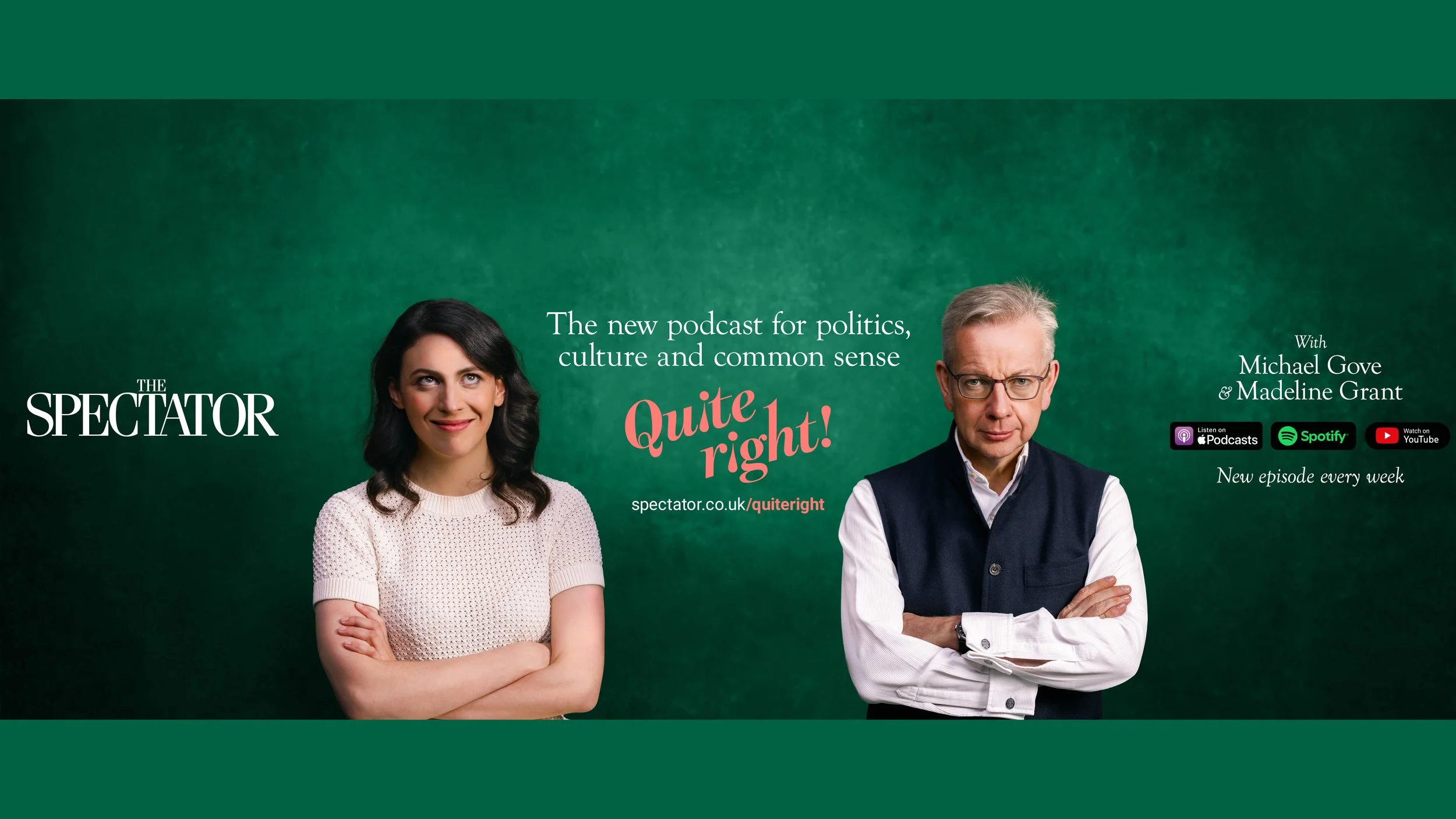
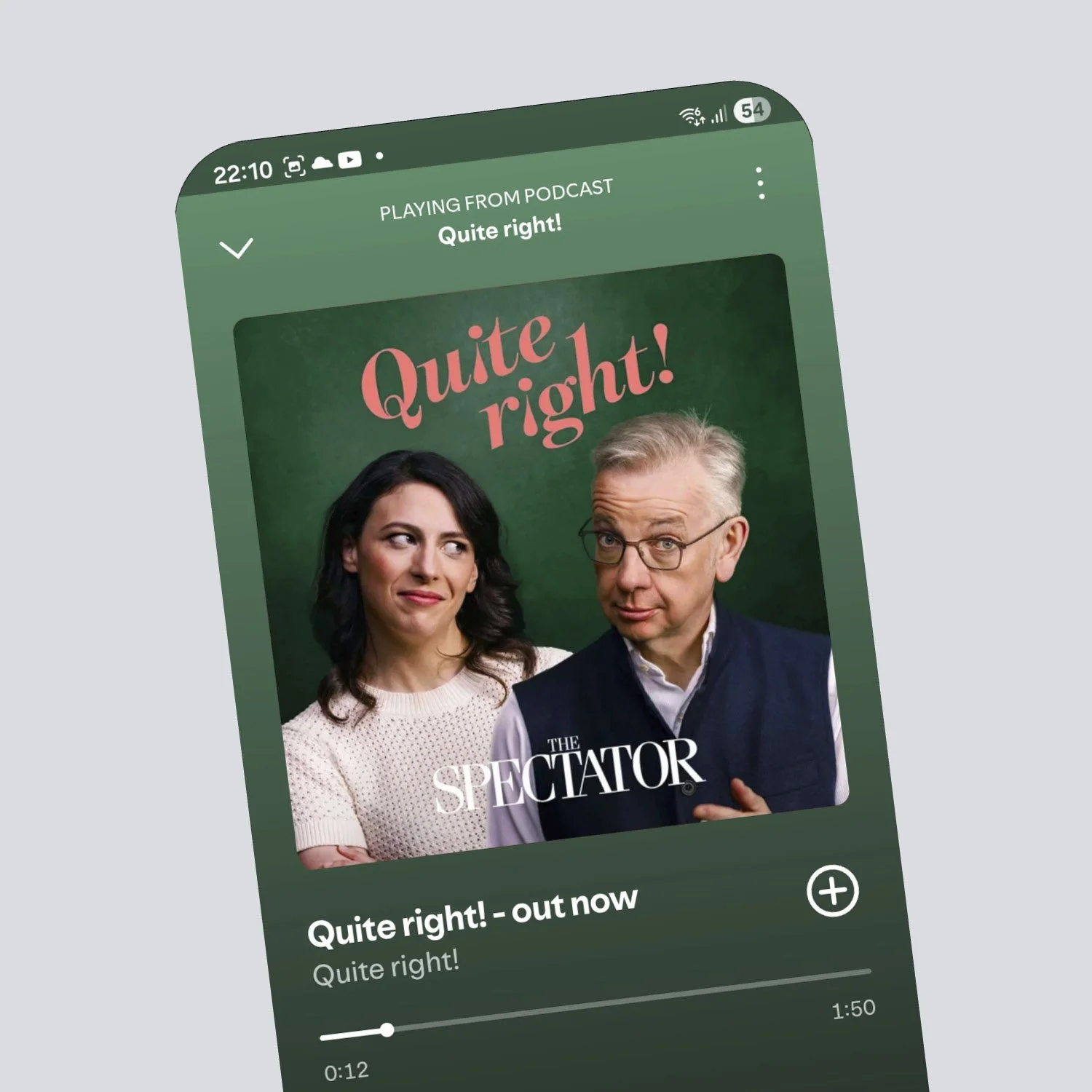
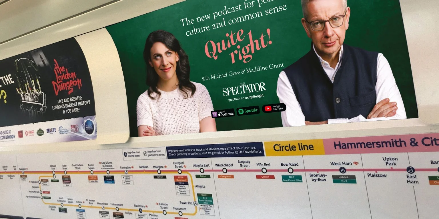
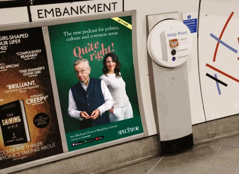
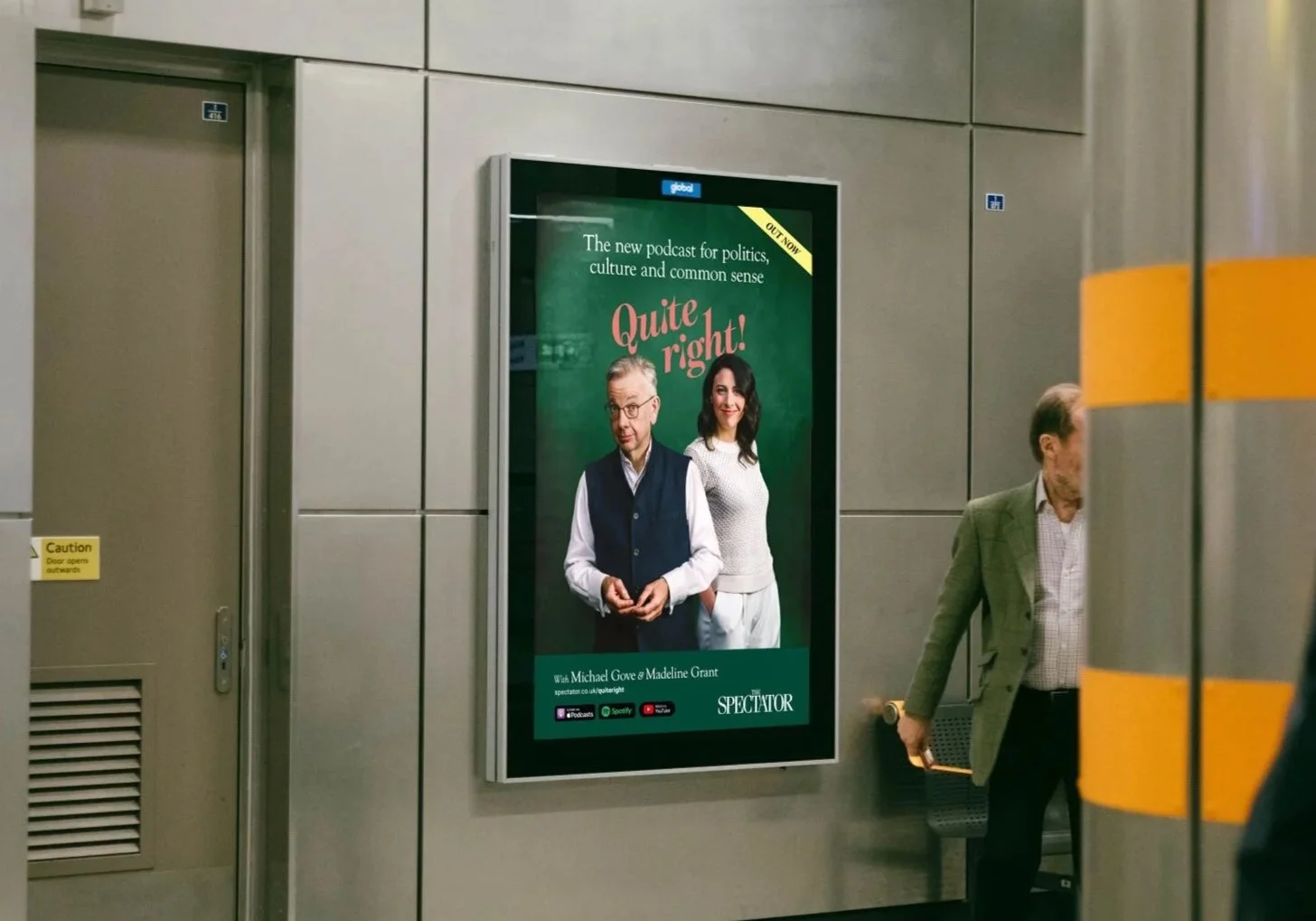
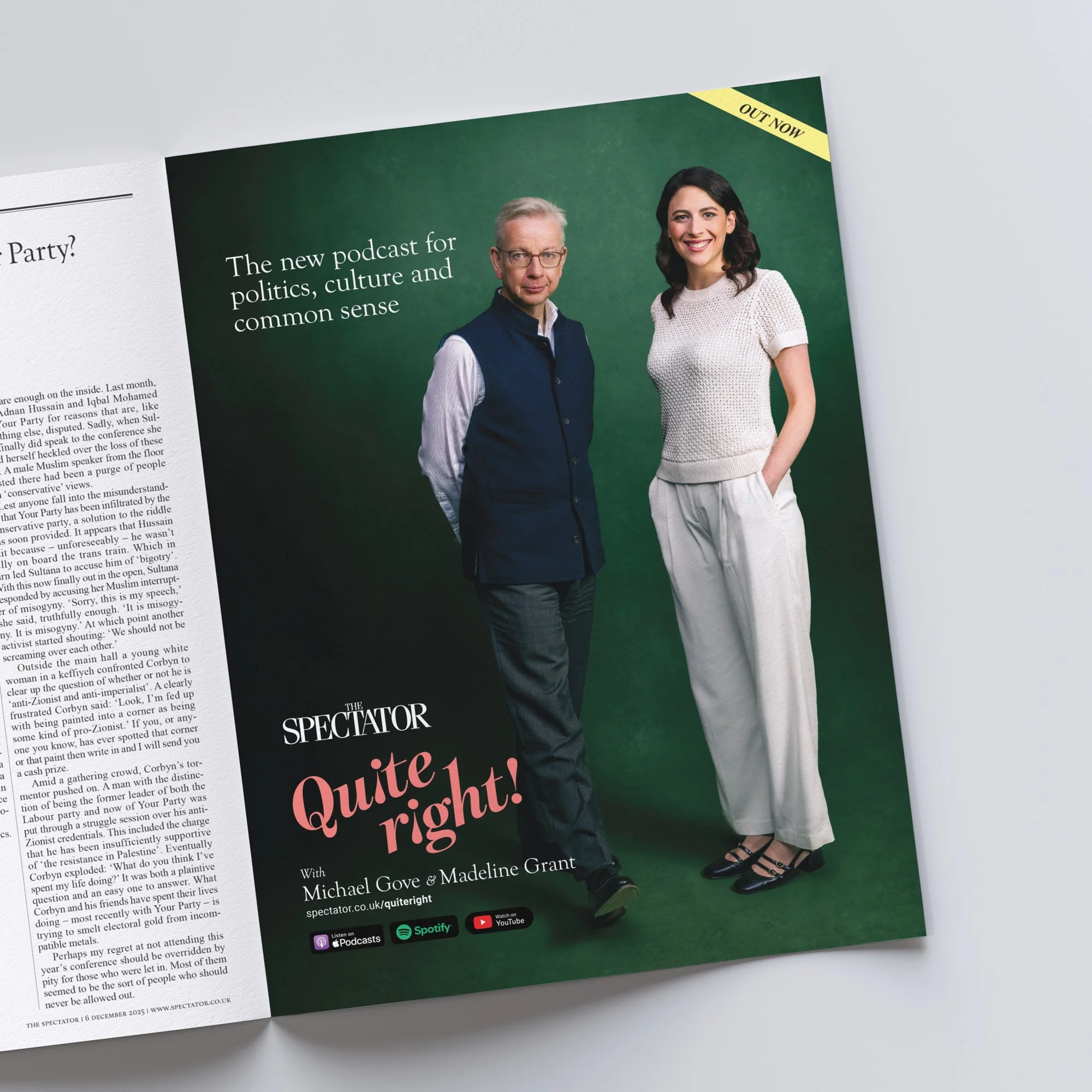
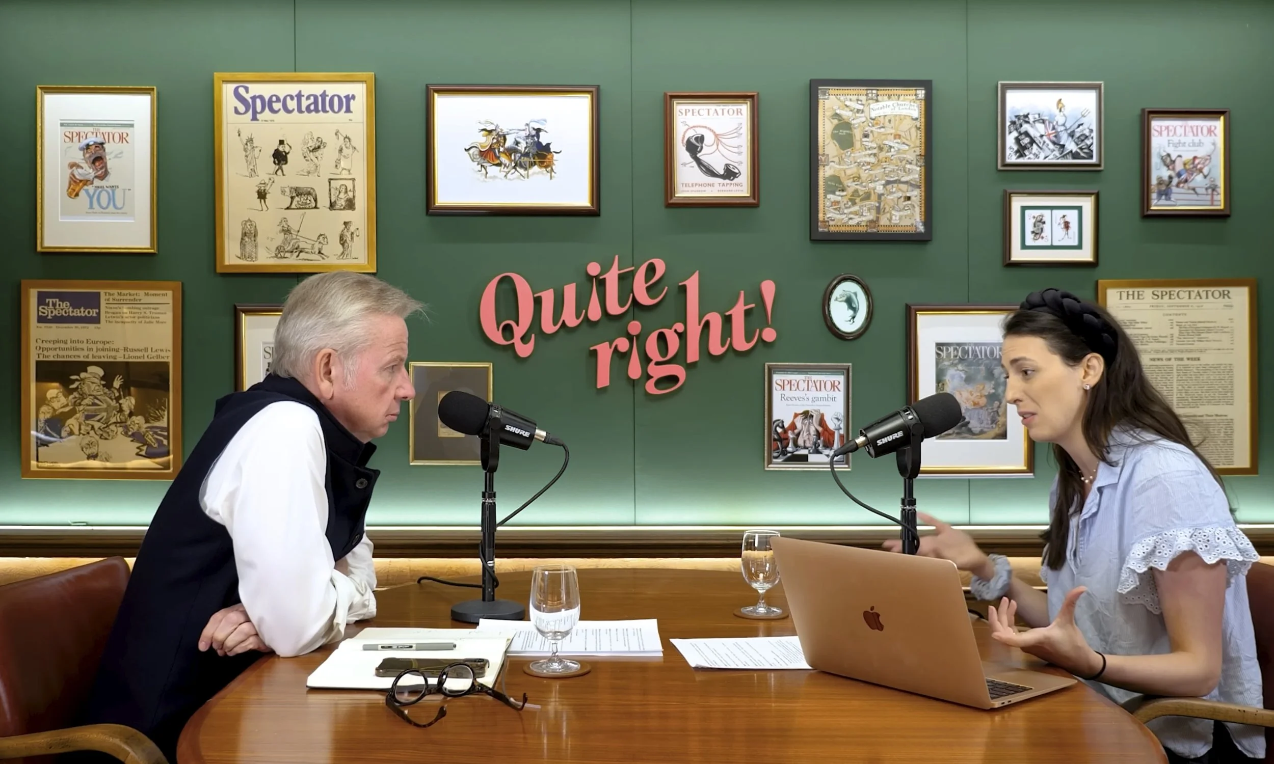
Quite Right!
Full art direction, visual identity & animation

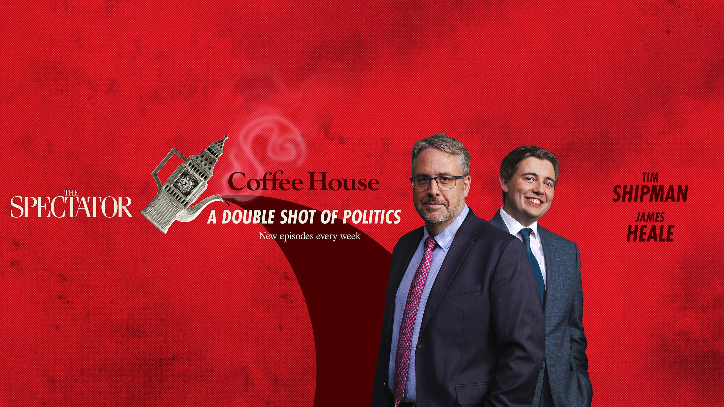
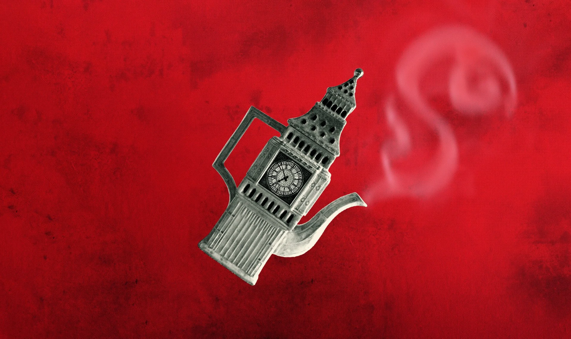
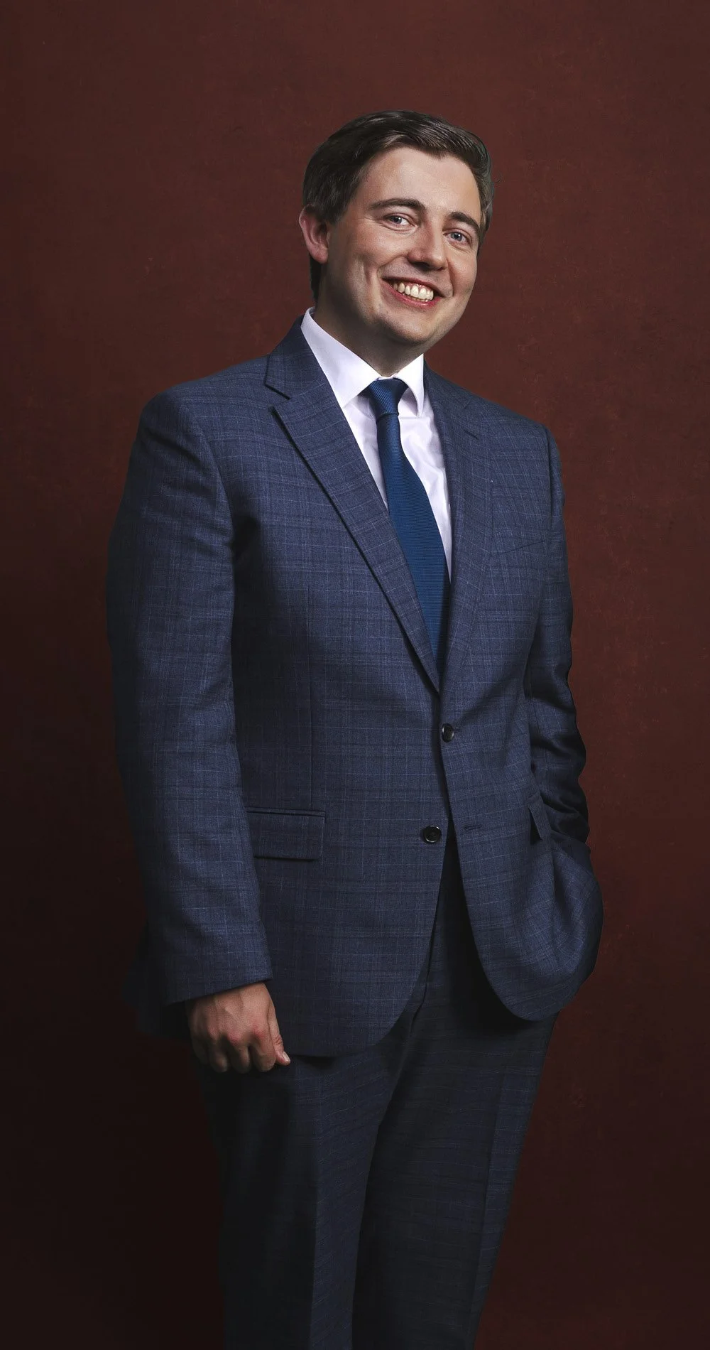
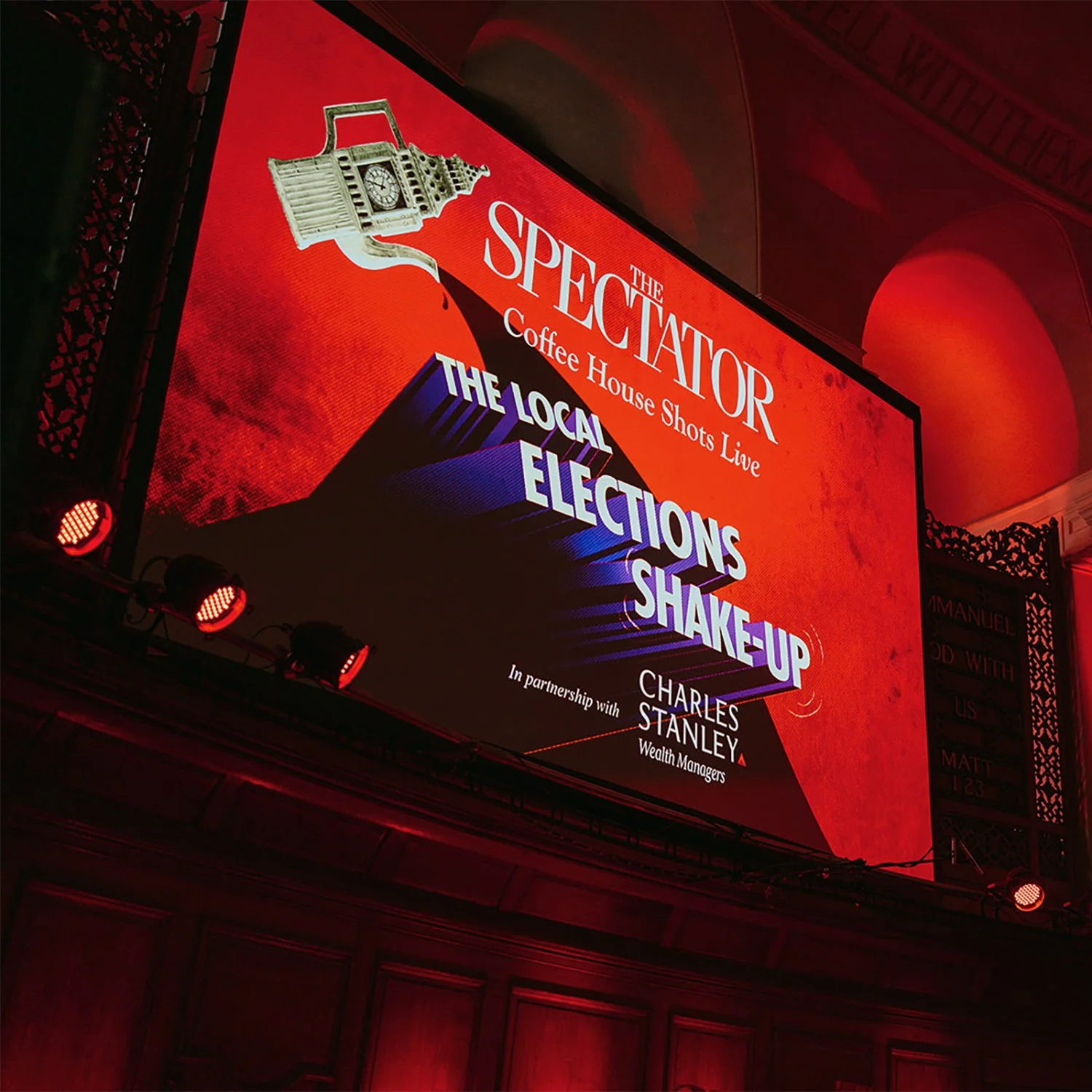
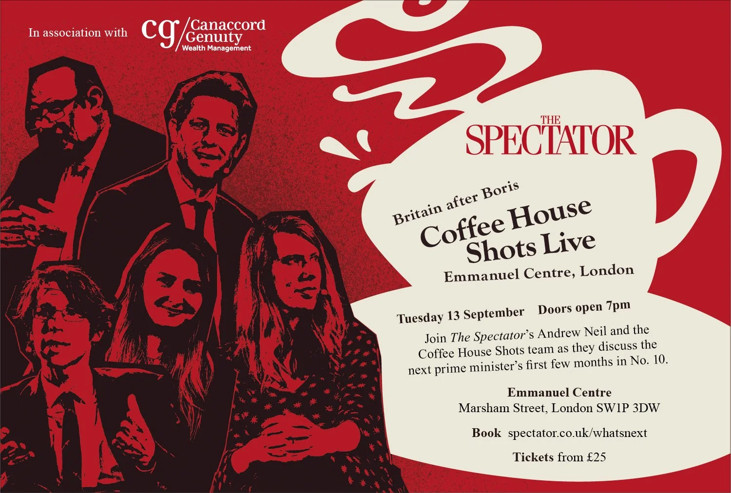
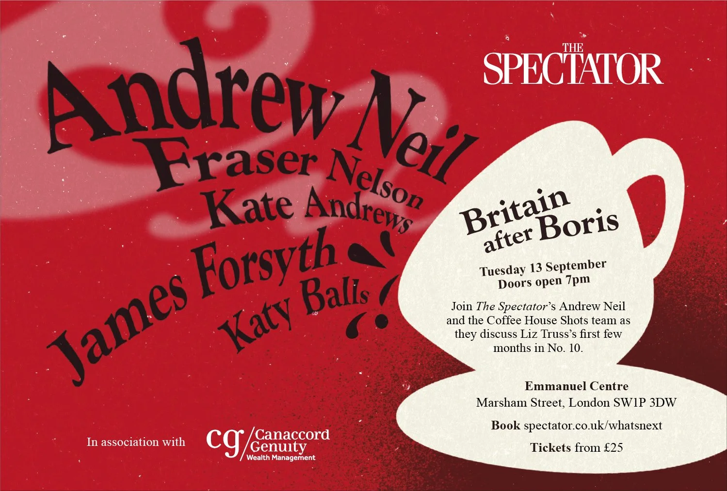
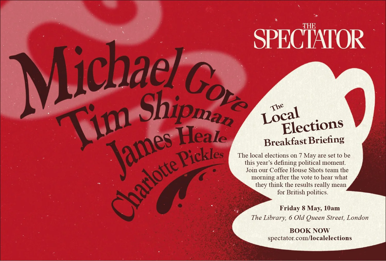
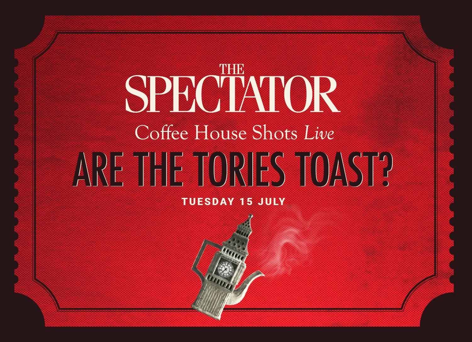
Coffee House
Visual concept, full art direction, identity & animation

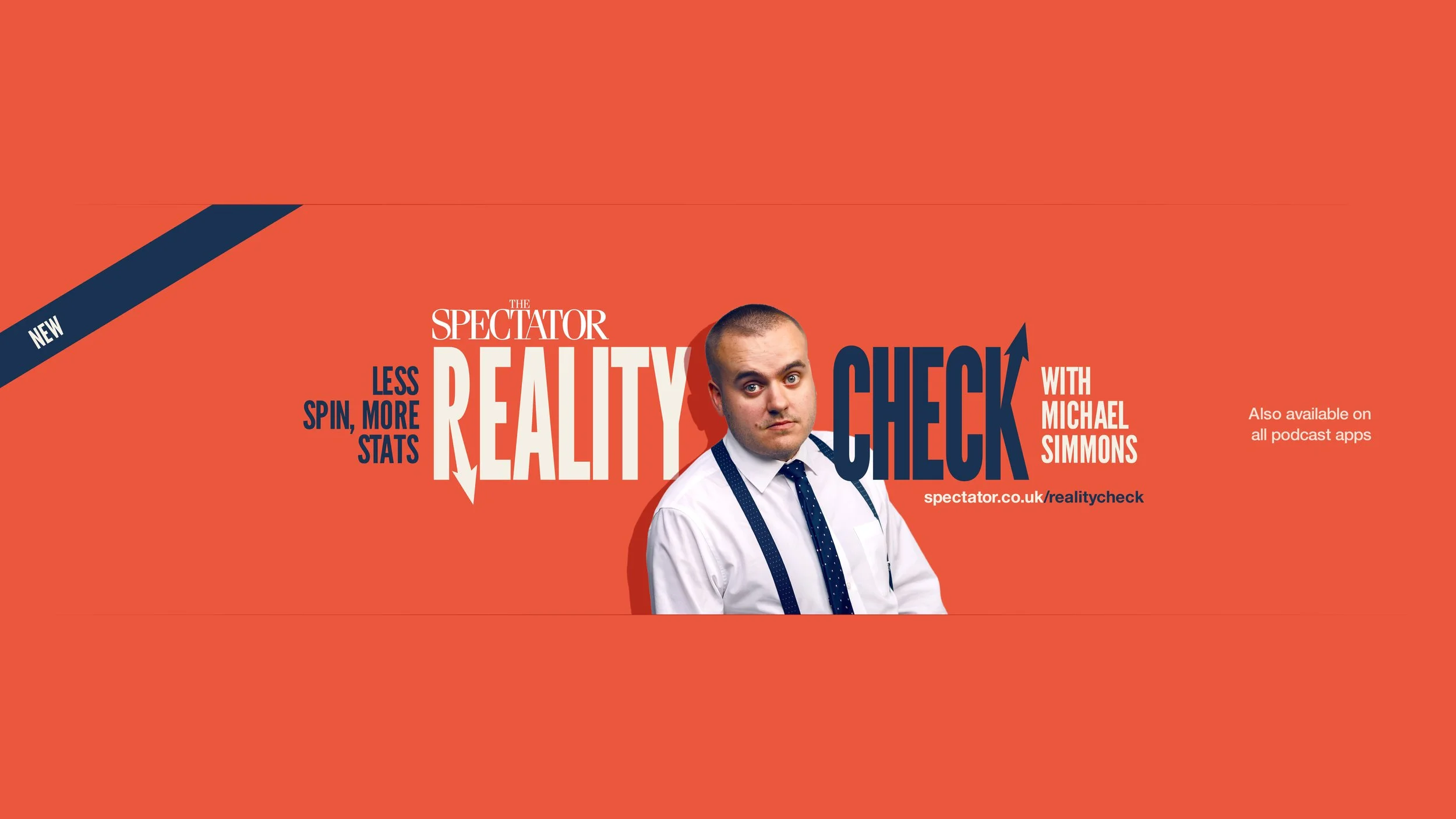
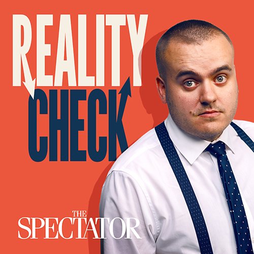
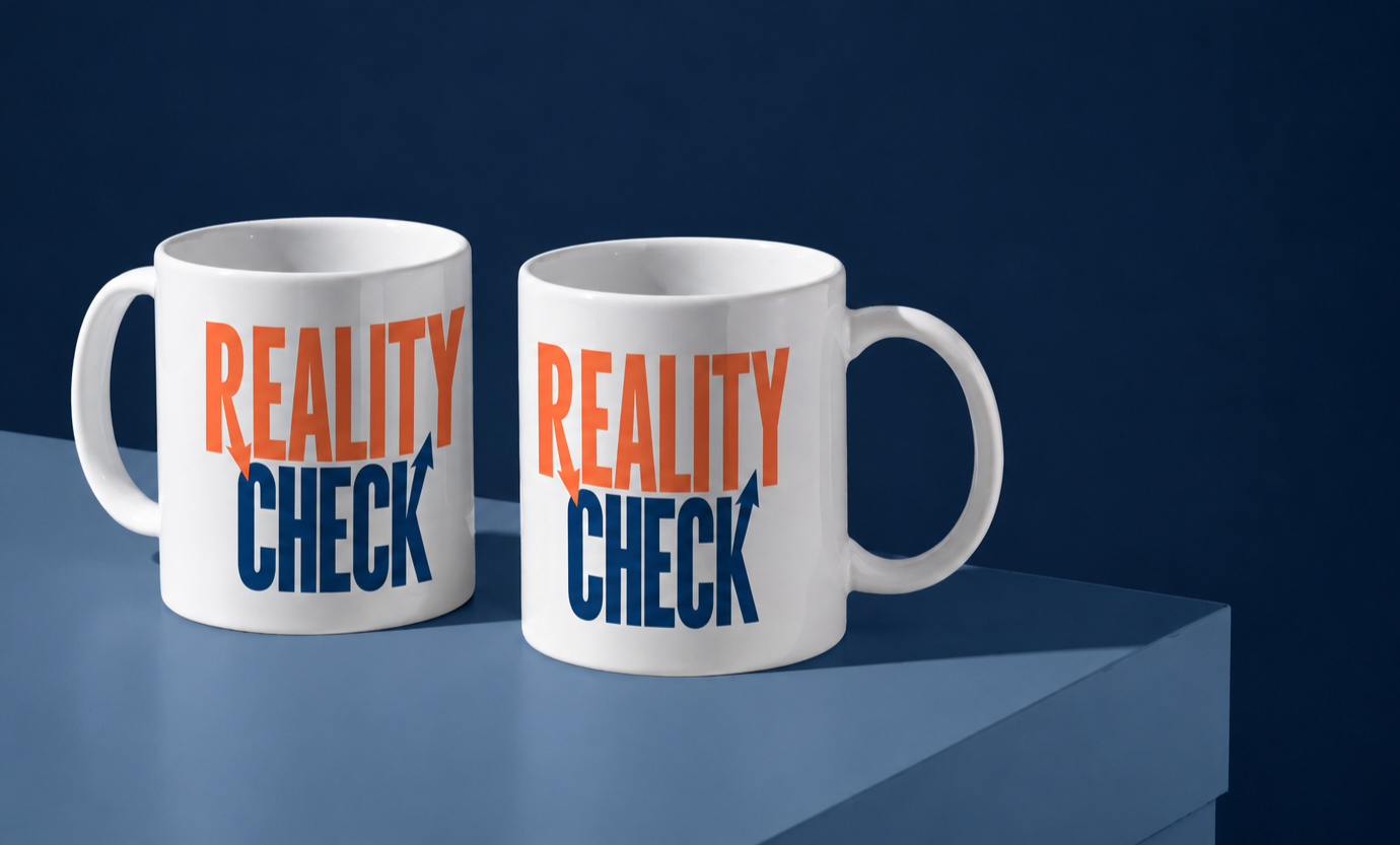
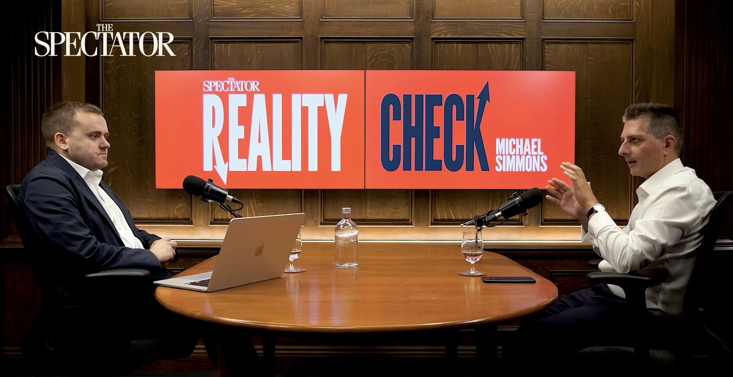
Reality Check
Full art direction, animation & visual identity

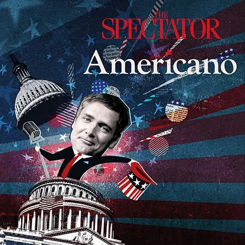
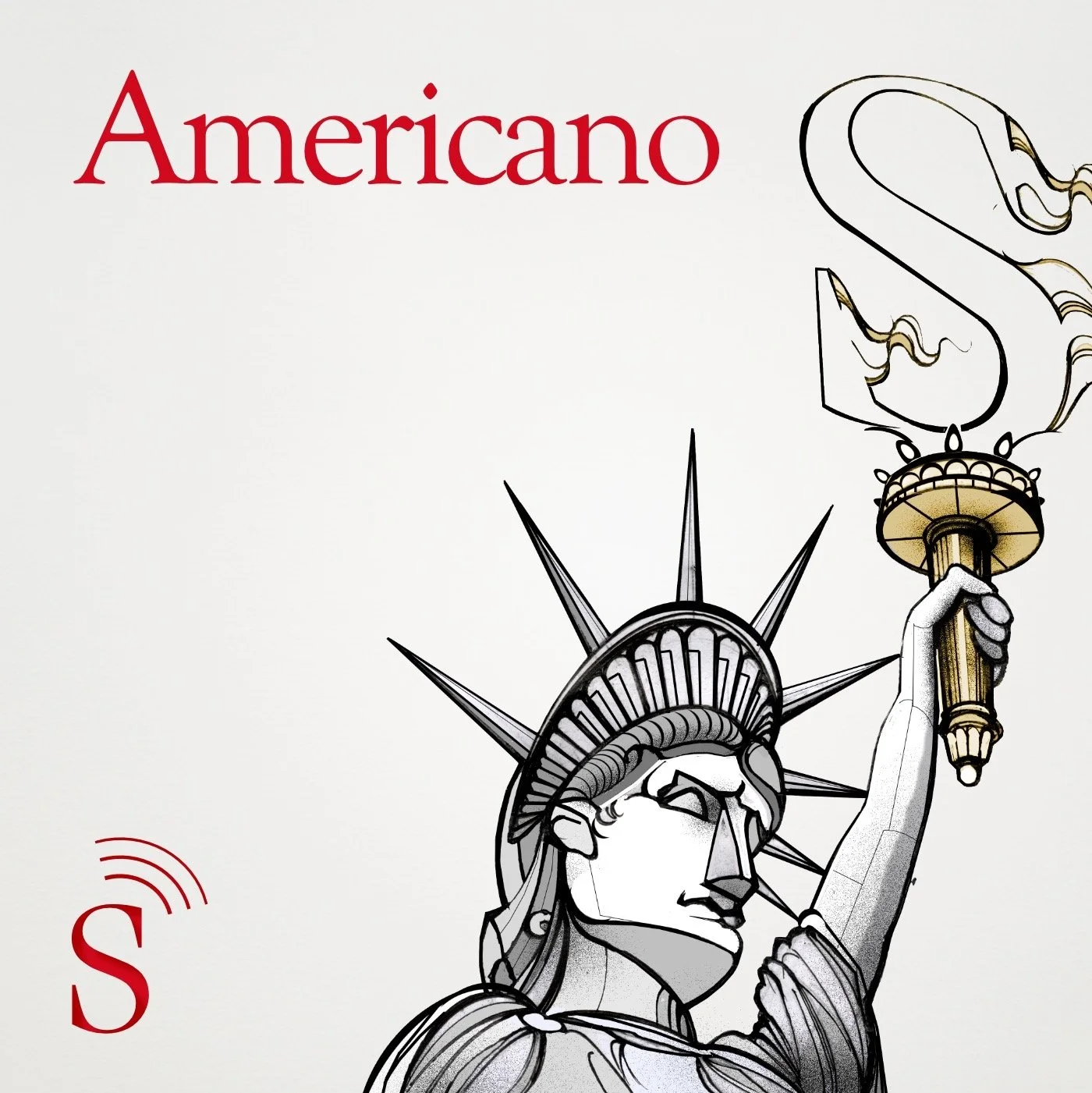
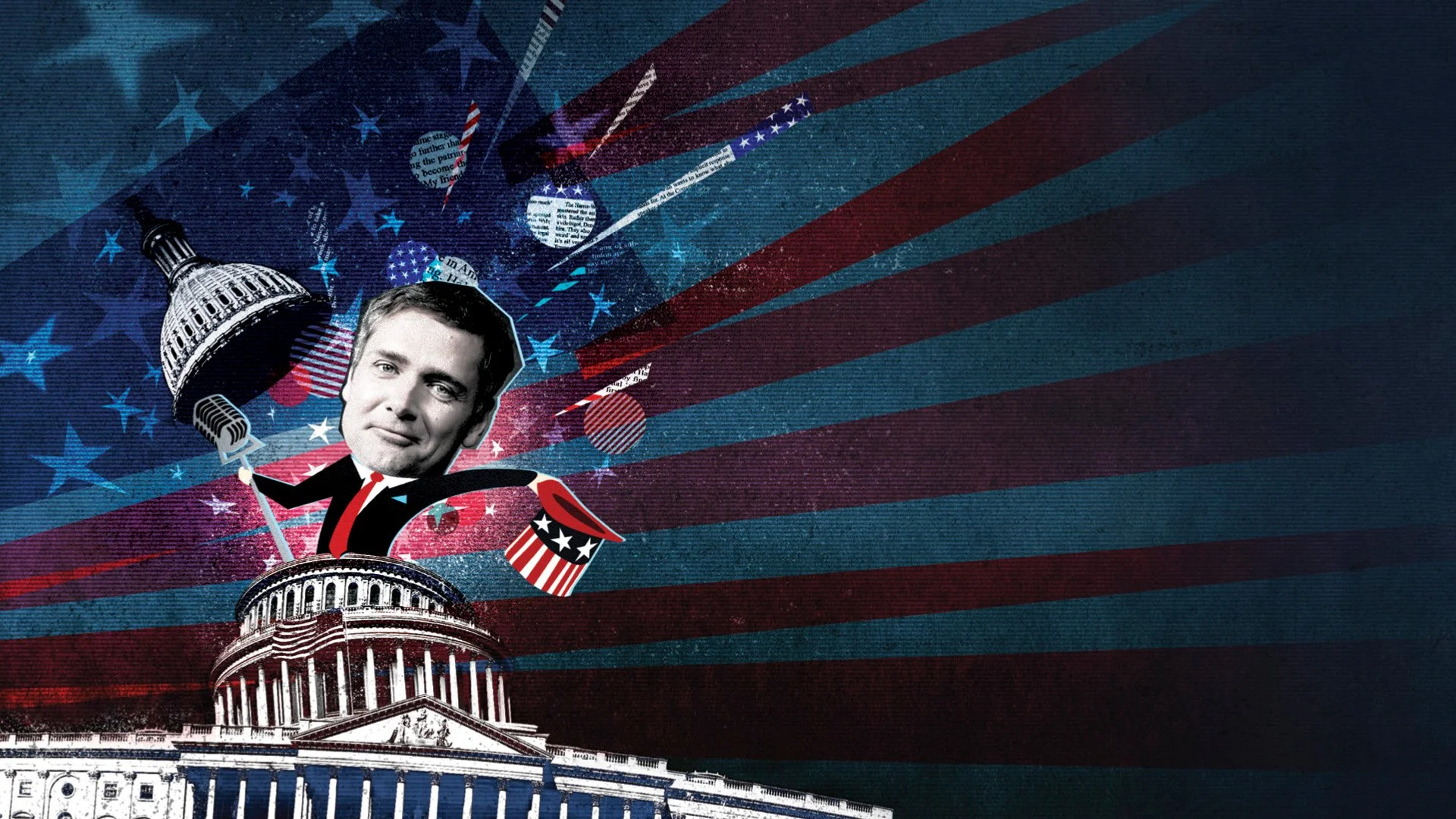
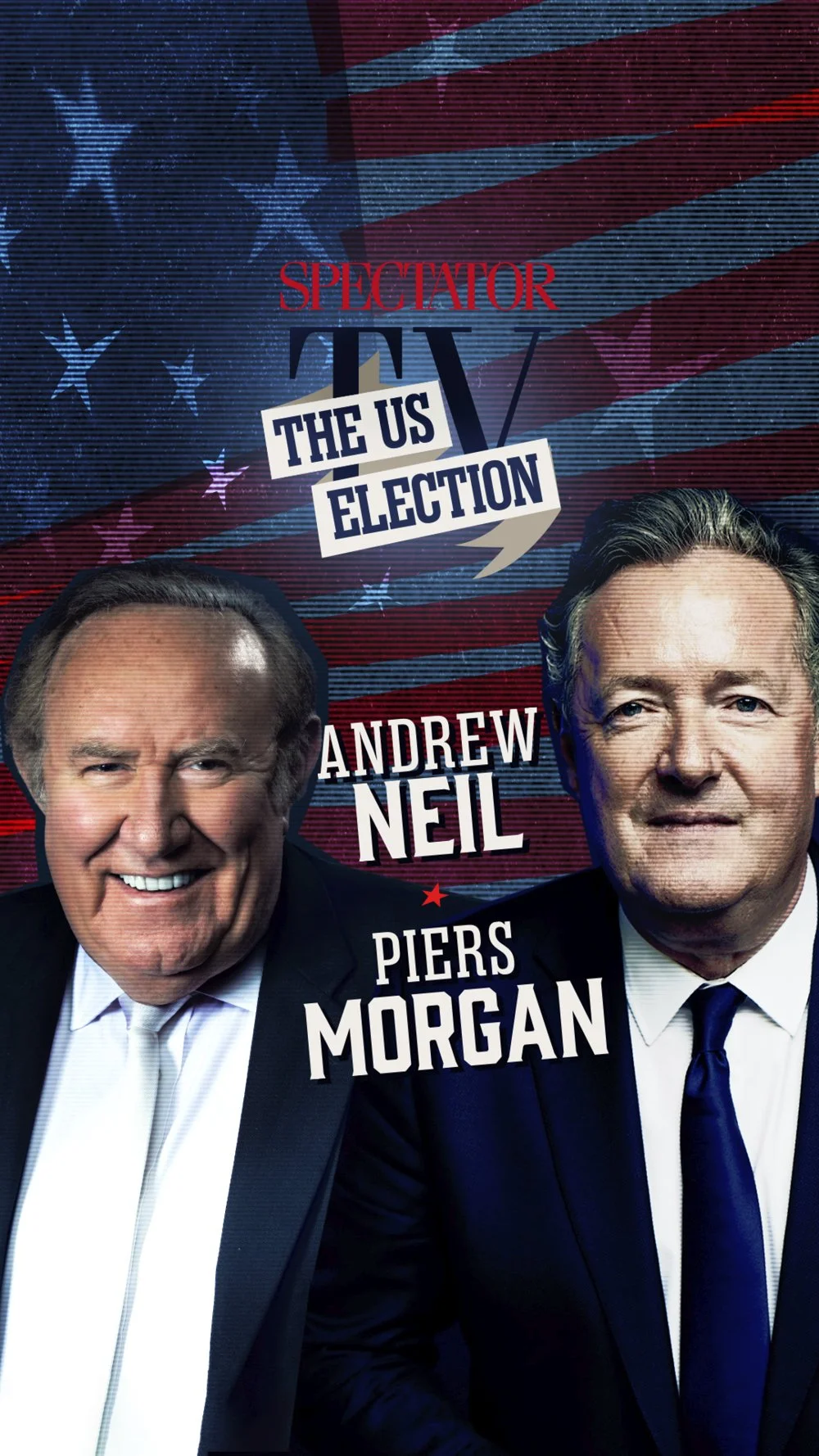
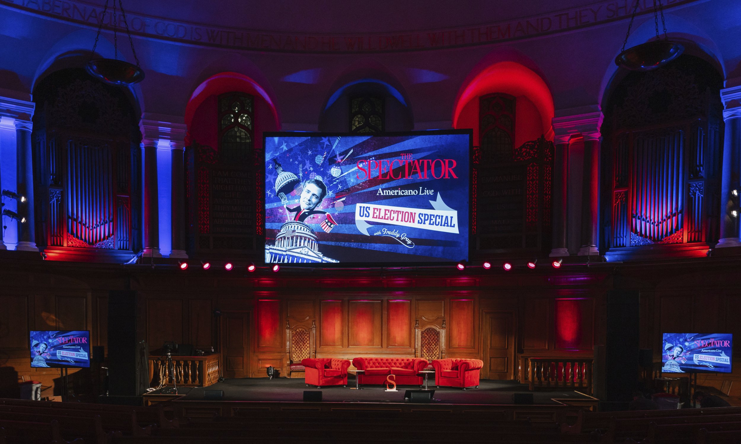
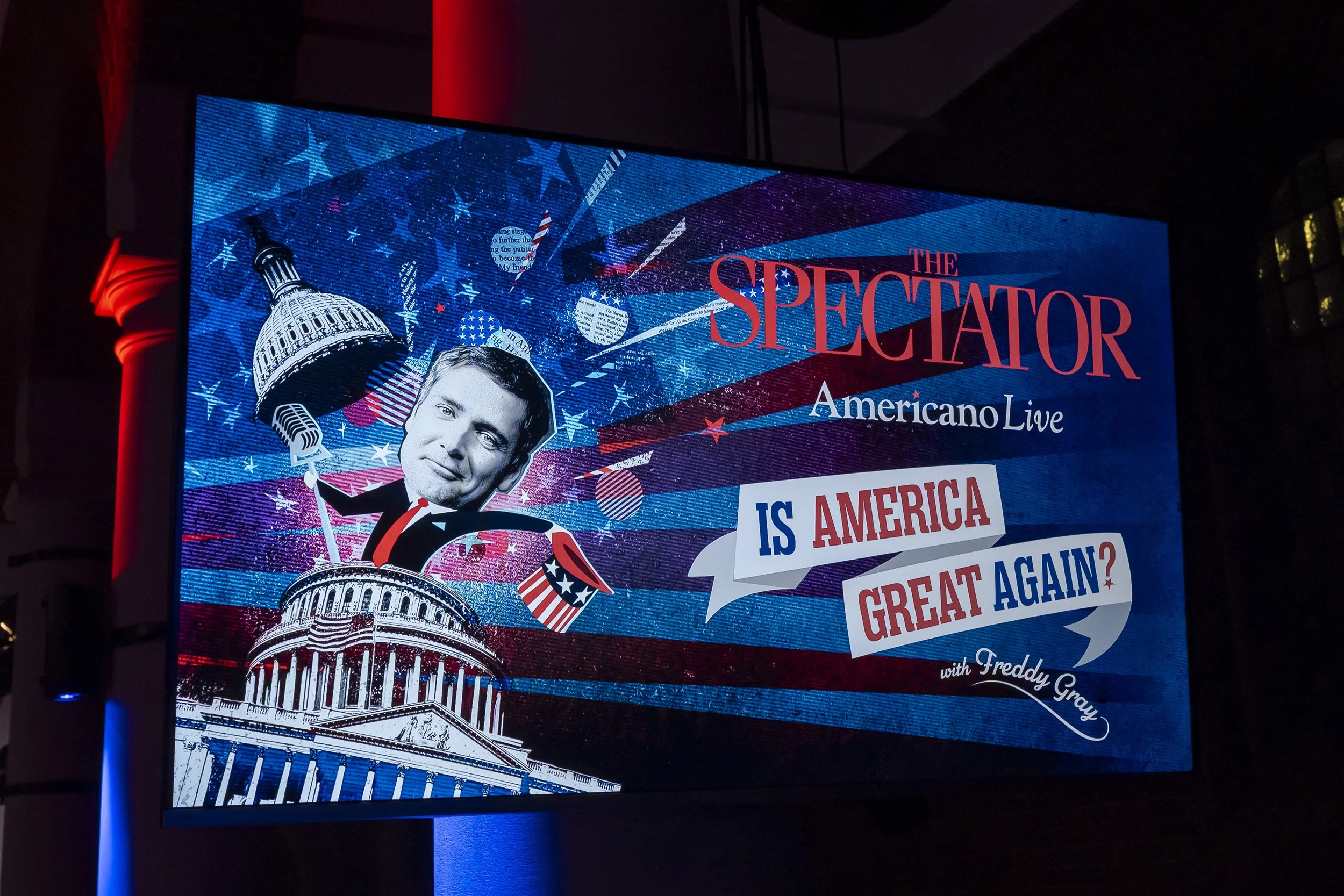
Americano
Full art direction & visual identity


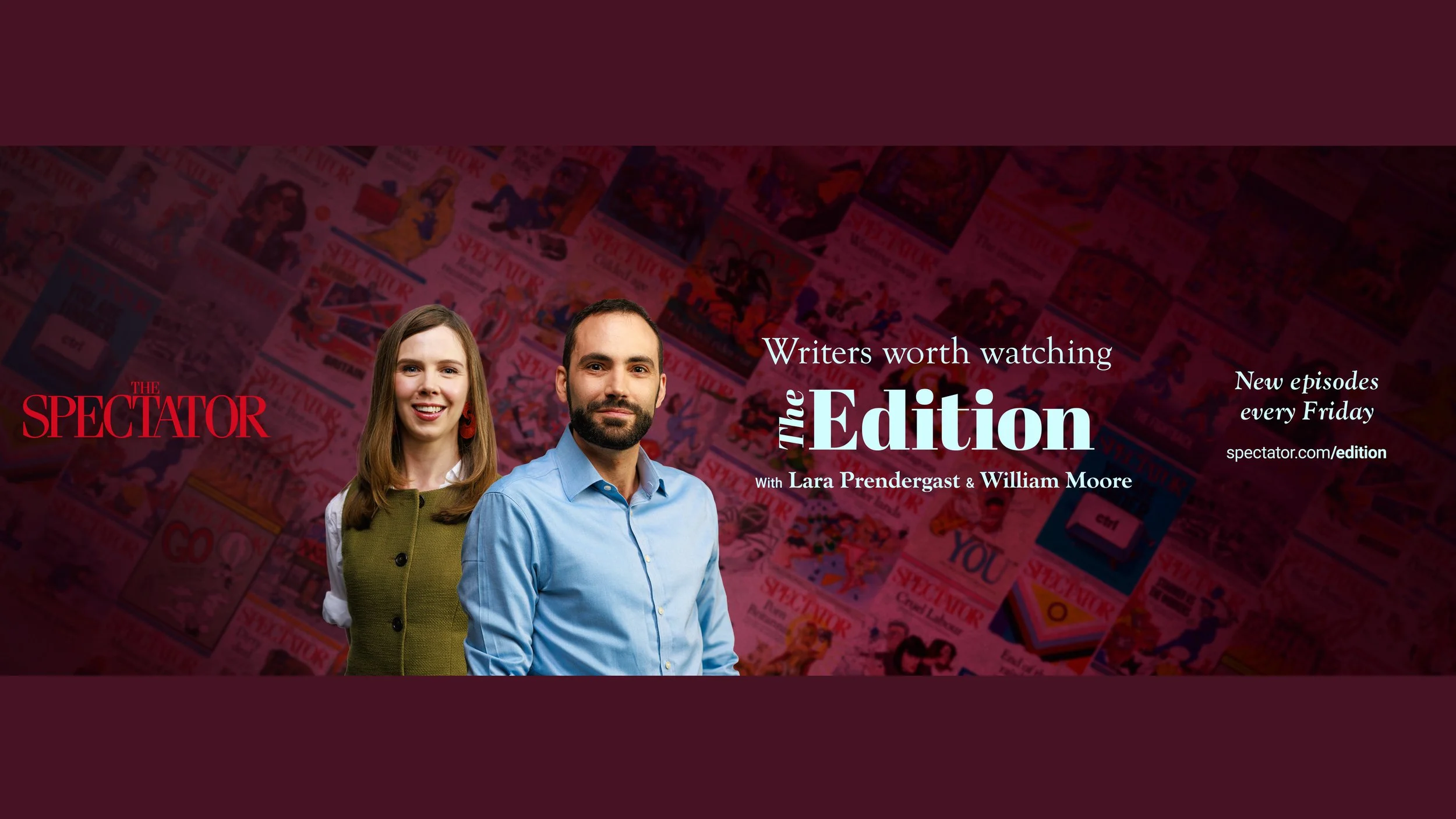
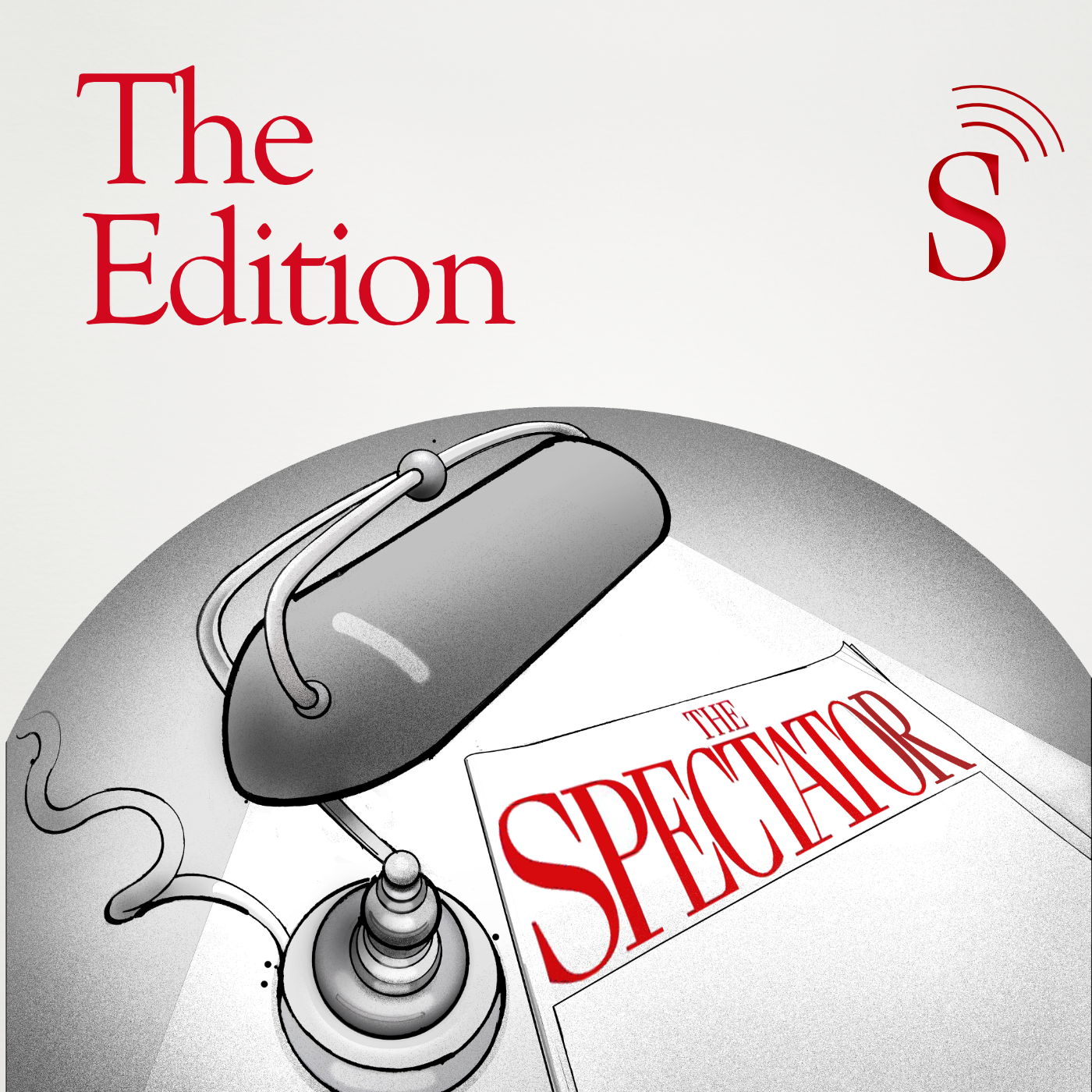
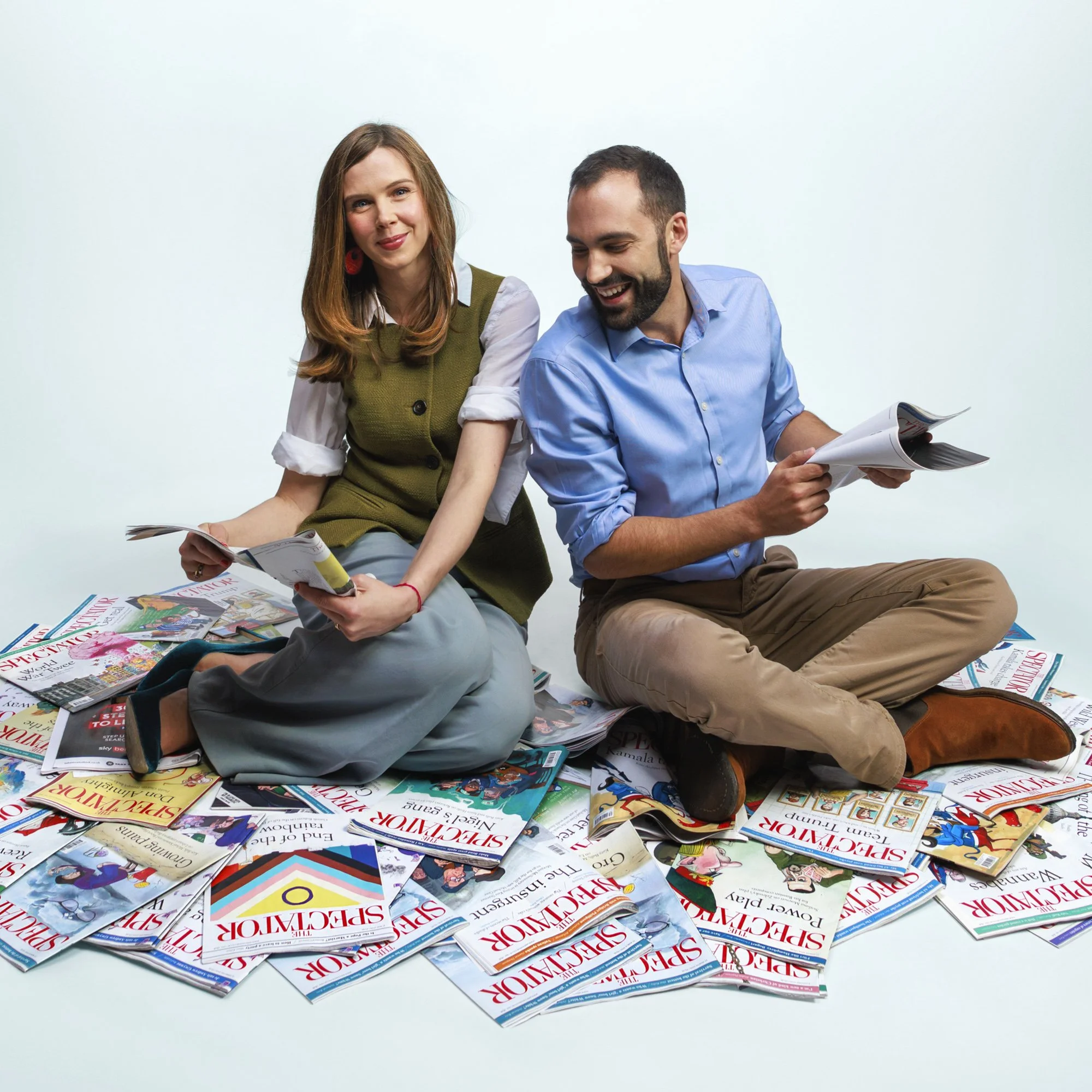
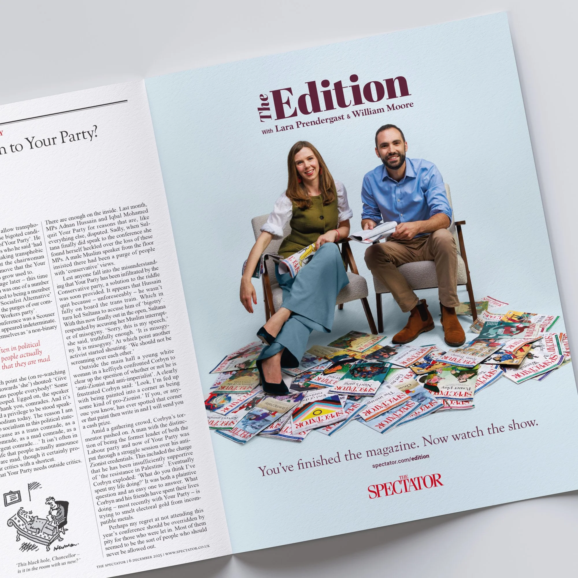
The Edition
Design & visual identity | Art direction & animation

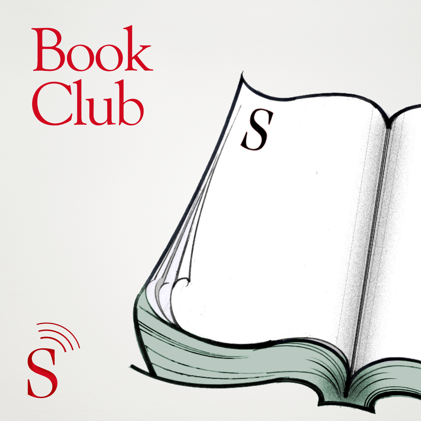
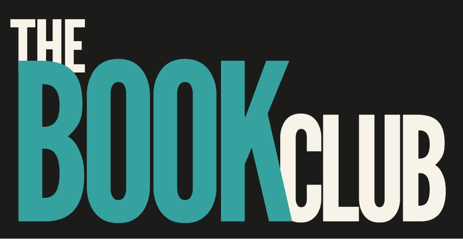
The Book Club
Concept | Visual identity | Illustration

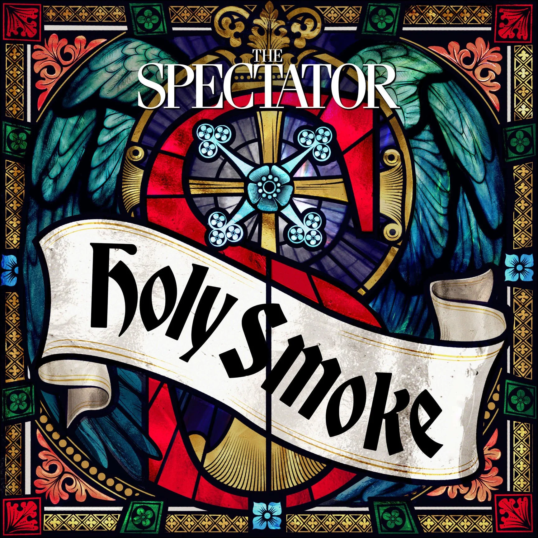
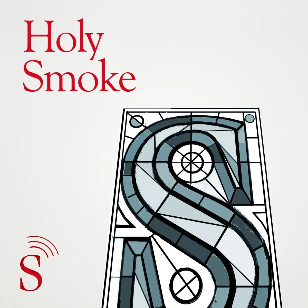
Holy Smoke
Concept | Design | Illustration
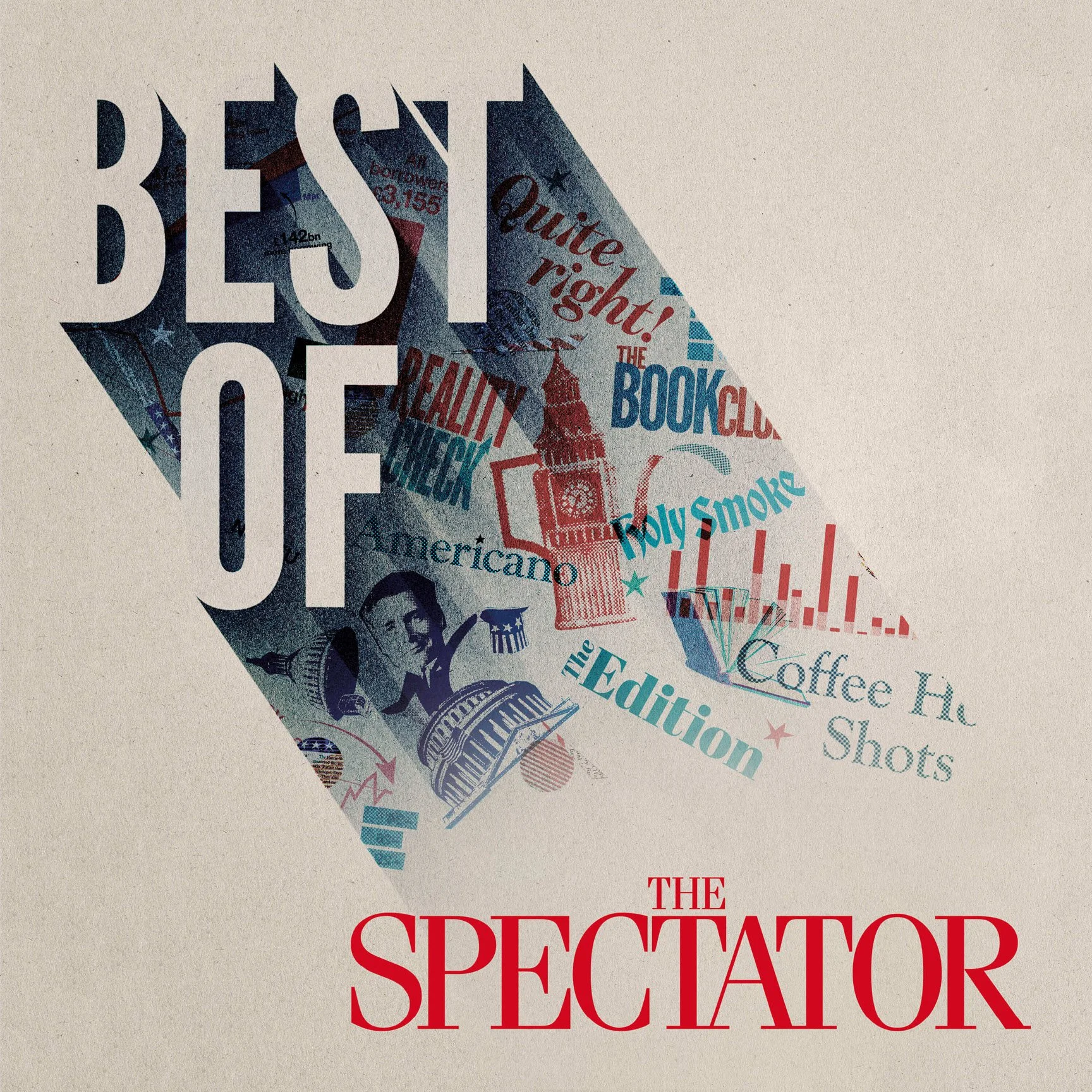
Best of The Spectator
Concept | Design & artwork